The Storybook team recently released the sixth major version of Storybook. Storybook 6.0 features zero-configuration setup, live edit of component examples, and support visualizing several storybooks in the same component explorer window (composition feature).
The Storybook team explained the choice of features for the new Storybook as follows:
We researched leading teams at companies like BBC, IBM, Cisco, and Shopify. These teams have successfully scaled component libraries and pioneered their own best-practices.
The new Storybook incorporates these best practices so that all teams can benefit. What’s more, we removed boilerplate and configuration to streamline your developer experience.
As a matter of fact, Michael Shilman asserted in the release note that the ability to get Storybook up and running without delving into configuration details came on the top of the list of advanced users’ desired features. The complexity of a storybook configuration is driven by the requested ad-hoc behavior (e.g. addons), story build process (e.g. Babel, Webpack, or TypeScript configuration), customization of the story rendering, and the desired customization of the Storybook UI. Storybook 6.0 claims to ship with best-practice features pre-configured: Storybook Essentials (a curated collection of six plugins), built-in TypeScript support, and presets for popular application frameworks.
Storybook Essentials includes Docs to auto-generate documentation, Controls to explore different component states with an auto-generated dashboard, Actions to check components’ interaction behavior, Viewport to verify components’ responsive behavior against different device viewports, Backgrounds to visualize a component against different colors and styles, and Toolbars for custom tooling – theming, i18n, and more.
The provided presets (also called project integrations) allow developers to use Storybook with React (Create React App, Next, RedwoodJS), Vue (Nuxt, Vue CLI, Vuetify), Angular (Nx), Web components (Open-WC), Ember (Ember CLI).
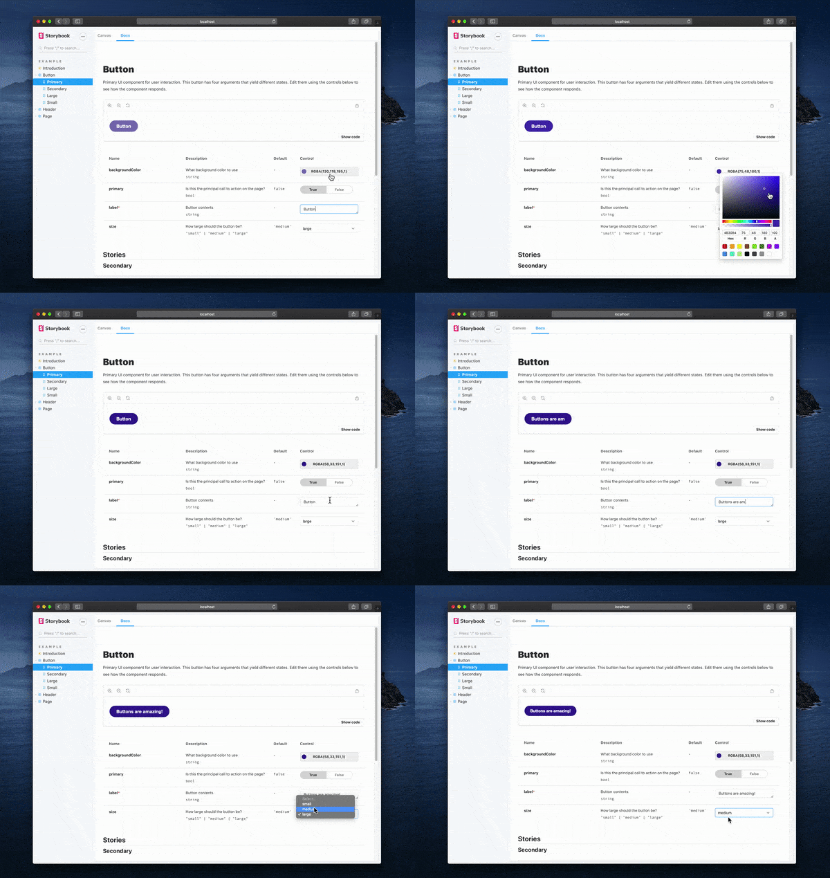
Storybook Controls allows developers to dynamically edit a component’s inputs without touching code. The Controls UI features graphical controls that are auto-generated from the component description (e,g, types) for rapid component experimentation:

(Source: Medium)
The Storybook team explained:
Components are complicated. It’s hard to predict how a component will react to different values and write stories for all meaningful combinations. So it’s super useful to be able to explore the state space interactively.
Storybook Composition gives developers the ability to browse components from any Storybook inside a local Storybook. The Storybook team described the feature as requested by teams at IBM, Cisco, and Chromatic who manage large UI efforts where it is useful to aggregate distributed projects. Such mature companies likely have multiple Storybooks; usually one for each project. According to the team, the ideal developer experience is to interact with all Storybooks together at once. The following flows are taken as an example:
- UI developers can reference prior art by viewing multiple Storybooks in the same place,
- Developers can see their custom components, together with the components of the design system that they are derived from
Storybook Composition may also enable developers to manage large Storybooks by splitting them into several lighter Storybooks without changing the browsing experience.
Storybook also ships with newly redesigned and rewritten documentation and many more improvements including lesser features and bug fixes. A comprehensive list of changes is available online.
Storybook 6 is almost fully backward compatible with 5.X. The Storybook published a migration guide that takes developers through the upgrade of Storybook packages, dealing with breaking changes, and getting acquainted with the recommended best practices.
Some developers on Twitter welcomed the new Storybook. One developer expressed his liking of Storybook Controls:
Love the new controls, looks much better than knobs
Another developer reacted positively to Storybook Composition:
Awesome! Hoping this will take away some of the issues faced when manually combining Storybooks
Storybook is available under the MIT open-source license. Contributions are welcome via the Storybook GitHub project and should follow Storybook’s contribution guidelines and code of conduct.